Don’t judge a book by its cover is probably the world’s most famous controversial phrase on books. Whether you’re a supporter or critic of this phrase, here are ten cover redesigns I loved or hated!
Redesigns I loved
#1 Shadow and Bone by Leigh Bardugo

Shadow and Bone alone is one of my favorite covers in the world, but based on the redesign – it is the best redesign I have ever witnessed. I absolutely dislike the old design – and now this marvelous cover! Definitely deserves number 1!
#2 Top Ten by Katie Cotugno
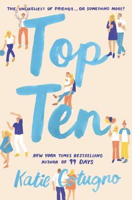
I have just come across this GORGEOUS redesign of Top Ten. The original cover was terrible and I couldn’t even bear to read the book in public. So this is heaven.
#3 An Ember in the Ashes by Sabaa Tahir
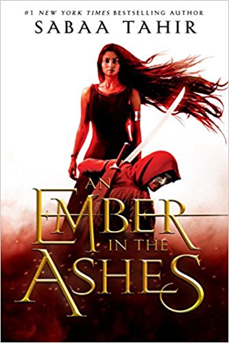
I am not usually a fan of real-looking people on the cover of books (I know I’m a minority here…), but this An Ember in the Ashes cover is a big improvement from the original, so I’ll let it count!
#4 99 Days by Katie Cotugno

Contemporary books tend to have the more beautiful covers (than fantasy, but again, that’s only my opinion!), but the first edition of 99 Days was just as awful as Katie Cotugno’s other books, so this one is a real life saver!
#5 Letters to a Law Student by Nicholas McBride

I know this is an educational read, but these books also have covers! And Letters to a Law Student went from a boring light blue cover to this explosion of colors which makes it way more attractive to young students!
Redesigns I hated
#1 The Hate U Give by Angie Thomas

The original white cover with the painted girl holding the title The Hate U Give was just a great cover. I don’t get why you have to create a new cover that isn’t breathtaking when you have a really intriguing one at you hand?
#2 iBoy by Kevin Brooks

I mean the original cover of iBoy wasn’t worth your attention – at least design a pretty cover and not an even worse one. I mean, come on – who designed this?
#3 My Lady Jane by Cynthia Hand

I mean, you get used to the new cover of My Lady Jane – I actually think the horse is funny. But the original cover was just a LITTLE MORE.
That’s it – thankfully, YA covers (I don’t like most of them, to be honest – especially fantasy covers are terrible) tend to improve while undergoing a redesign, so I can’t find any more bad results for now! Enjoy your day!

I like the redesigns of The Hate U Give and My Lady Jane- I hadn’t seen those yet!
LikeLiked by 1 person
I know, I also came across them very unexpectedly… I also like My Lady Jane, although the original was better… but it is funny with the horse!
LikeLiked by 1 person
YASSS! The Shadow and Bone redesign is so gorgeous! I totally agree with you on THUG and MLJ, those newer covers are absolutely awful. They don’t really capture what the book is about! Awesome post💜
LikeLiked by 1 person
Thanks 😍😍😍 and yes, Shadow and Bone is one of my faves ever😍😍 and yesss, they really don’t capture the speciality anymore …
LikeLiked by 1 person
I was actually happy when they redid the Shadow and Bone series! I like the new covers so much better 🙂
LikeLiked by 1 person
Same here!!!! The originals weren’t pretty at all….
LikeLike
I have to disagree about the Shadow and Bone covers. I really liked the original covers. I thought the greys and red really wen well with the overall atmosphere of the stories and I feel like the new covers are perhaps a bit too colourful even though they are pretty.
But I most definitely agree about the My Lady Jane cover!!!
LikeLiked by 1 person
I totally know what you mean! The story is rather grey and dark and that really was what the original cover displayed! So I totally get you!
LikeLiked by 1 person
I agree with An Ember In the Ashes! The redesign is soo good!
LikeLiked by 1 person
So true!!!
LikeLiked by 1 person
I love the redesign of Shadow and Bone. It’s attention-grabbing without being too busy. They did a fabulous job with it.
My TTT.
LikeLiked by 1 person
Exactly!!!! 🥳🥳
LikeLike
great post and I SO agree with The Hate U Give and An Ember in the Ashes!!!
LikeLiked by 1 person
Thank you! And yayy🥳🥳🥳
LikeLiked by 1 person